Most small businesses overlook the importance of having a well-designed website. As a small business owner, you should stay on top of the rapidly changing web design trends so you can continue to convert visitors into customers. Your website should be visually appealing, easy to use, and most importantly, functional.
We’ve listed the top website design trends you should start using to create a great website.
1. Large Images and Fonts
To date, an increasing number of websites are using large images and fonts to create impact and effectively deliver their brand message. NN Group states that users usually spend 10 seconds or so before clicking the back button and abandoning your website. Ten seconds may seem a short time, but it’s just enough to capture potential customers’ interest and keep them engaged.
Large images are visually appealing, allowing you to make any content on your website visual. On the other hand, large fonts create impact, are extremely easy to read, and can deliver brand messages more effectively. They’re also particularly sleek, and will certainly make your website stand out from the sea of companies vying for attention.
2. Break Up Content with Photography
Image:http://marketblog.envato.com/wp-content/uploads/2015/05/04-the-coffee-trike-website-homepage.jpg
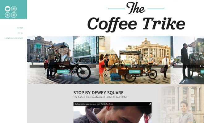
It’s nice to have information on your company’s website, but most of the time, your visitors want to know just what your company does, where your company is located, and how much your products and/or services cost. As such, you may want to avoid making your website off-putting with too much text. Instead, you can use photography to break down content.
The benefits of displaying photos of your products or store on your website are many. First, they demonstrate a down-to-earth feel that many large corporate websites don’t have, thus giving your business more personality. They also help you showcase your offering of products and services, and give people an idea of how your business model works.
It’s much easier to assess whether or not your services or products are what they need if they can see instead of read, so use imagery to your advantage.
3. Use Ghost Buttons
Ghost buttons are becoming increasingly popular — they’re attractive, catch visitors’ eye from the very beginning, and work well with almost any design. Ironman and Star Trek reboot have used ghost buttons, so there’s no reason not to use them yourself.
Consider using a ghost button for your call to action. Placed on an interesting image, the button will become the focal point of your design, giving everything an extremely pleasing feel. You can use ghost buttons without an image as background. It’s important to create balance in your design, otherwise the result won’t be the one you hoped for.
4. Switch to a Grid Layout
Image:http://media.creativebloq.futurecdn.net/sites/creativebloq.com/files/images/2013/02/kayla.jpg
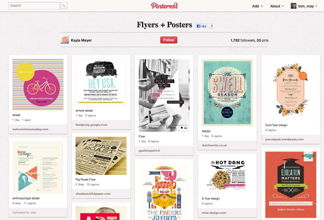
Are you a local fashion or accessory store, a candy supply store, or just a brick-and-mortar company offering basic services like residential cleaning? No matter what products or services your business offers, a grid layout can certainly help with presentation. Think of Pinterest — there are nearly 50 million active members using the platform, meaning it’s very attractive to them.
Why not take advantage of that and implement a similar grid layout on your own website? Users can easily view each item one by one in an organized and logical way, and they won’t have to deal with unnecessary details that may be actually a turnoff.
You can find plenty of pre-made themes for your website — WordPress in particular has tons of them — with grid layouts. If you’re working with a web design agency, you can ask them to create a new and completely original grid layout design for your website.
A Word of Advice: Make Sure Your Website Is Mobile-Friendly
Image:http://www.bluetrain.ca/wp-content/uploads/mobile-friendly-algo-update-featured-image.jpg
The importance of mobile friendliness keeps increasing, especially since Google has rolled out its mobile-friendly algorithm update, codenamed Mobilegeddon. To avoid a potential penalty from Google, make sure your website design is responsive, and works well on any device, whether it’s a PC desktop or a smartphone. This will also ensure that users won’t abandon your website in favour of your competitors’, so you will be able to generate more leads, sales, and decrease your bounce rate at the same time. You can use Google’s tool to asset if your website is mobile-friendly or not.


