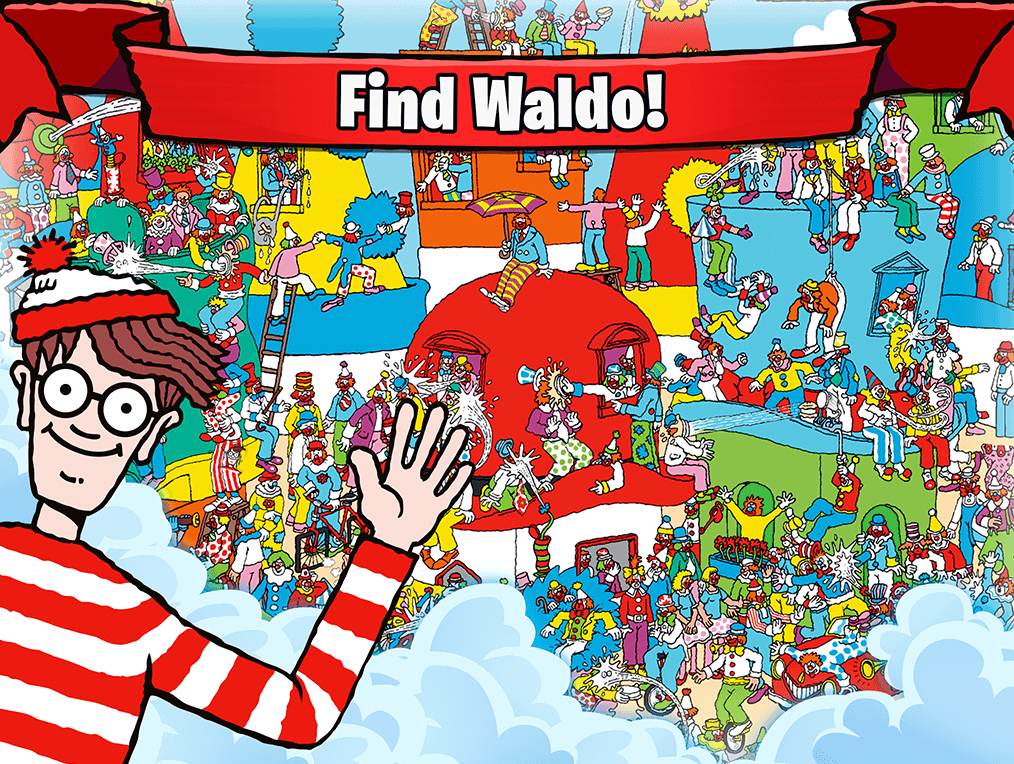
“Where’s Waldo” is predicated on a basic principle; it’s difficult for humans to discern what is worth paying attention to, and what is noise. Therefore, we rely on visual cues and other stimuli to make informed decisions. Whether swerving in traffic because the car ahead swerved, (without us even seeing why), or screaming in terror (without seeing the actual threat) triggered by friends, we make judgements based on limited data available to us at any given time. Consumers are people, and they are shopping online. Whether from traditional computers, tablets or mobile, the consumer is drowning in opportunity; a completely saturated business market, with more choices than possible to weigh in an objective framework. A brand used to rely on bright billboards, clean countertops and friendly staff. Real life isn’t usurped by digital (yet); however, digital is often a brand’s first impression. In a sea of contenders, consumers are forced to judge a book by it’s cover. The shallow principles of online dating take this conundrum to its logical conclusion; too fat, too thin, too this, too that, all within a matter of seconds. As attention spans begin to dwindle to a paltry 8 seconds, digital experiences need to be professional, sharp and engaging. One company, Splendor Design Group, located in Red Bank, New Jersey, has stood out from the pack by simply focusing on the few, not the many.
Award Winning Design: Because Mediocrity is for Losers

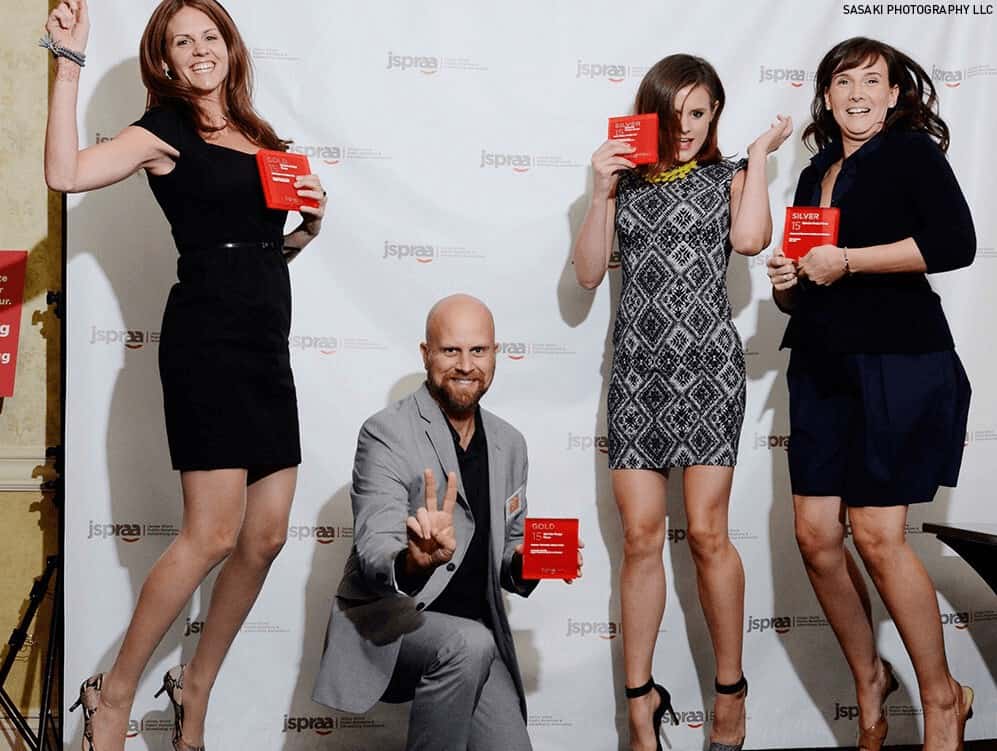
Adam Taylor, CEO, can be seen striking a pose alongside his team winning the prestigious Gold Jasper Award, bestowed for logo design of Monroe Township Public Library. While premade template website builders can be modified to look beautiful, they often lack functionality and intricate details privy to a professional coder and graphic design team. Much like animation is a medley of cooperation amongst artists and animators, a digital experience is the culmination of a visionary, (Adam Taylor), graphic designer to create visual assets, and a coder to bring everything to life. A web experience use to be rigid, petrified, museum-esque, view but don’t touch; with a background in art design, music, and MENSA, Adam set out to change the way people, businesses and end-users alike interacted with websites. His unique skillsets and perspectives were the catalyst to creating websites which evoked emotion and triggered calls to action, whether phone call, contact form, or other subconscious triggers (one Vodka company experienced an increase in sales when the website suggested recipes). Unbeknownst webmasters are left derelict by premade big box web builders. The idea to showcase high res photos, videos and suggest recipes would never have been birthed without the guidance of a professional designer, coder and marketer; in its stead one would expect to see stock photos, a basic contact form, and a writeup about the vodka’s features and benefits. A peanut butter and jelly, plain jane vanilla, uninspired “website”. Juxtaposed high res photography and professional videography, combined with a user-friendly landing page for each drink cocktail led to national sales increases and additional press inquiries. Very rarely will a DIY project turn into a success, or it’s whimsical hail mary, a resounding success. Companies who refuse to embrace technology and art to tell their brand’s value proposition are abdicating to competitors, content with losing in the marketplace.
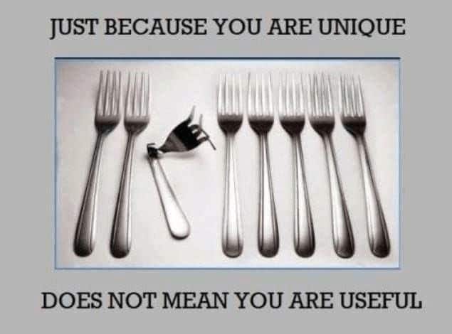
Unique Isn’t Intrinsically Valuable
 A website has to serve a purpose. Form follows function; accrue a modality of actions: calls and emails predominantly. Of course there are others such as real world brand synergy and opting in to email/social media list as a follower. If a website isn’t performing it’s function well, it’s said to have a low conversion rate. Premade websites can produce higher conversion rates than custom websites when principles of design and marketing are not aligned. If a website satisfies basic questions, known as FAQ (frequently asked questions), such as who are you, can I trust you, have you done this before, and how much is it going to cost me; then, and only then can hierarchal needs flourish – visual artwork, design, flow, custom digital assets. Much like humans require food and shelter on the life pyramid of needs before love and leisure are pursued, website traffic end users (cold potential clients) need to be satisfied they found a prospective answer to their problem in the form of information (content), product or service. If both steaks appear equally tender and juicy, it’s the one with sizzle which garners most attention. Now, when competitors go head to head in storytelling, value proposition, and calls to action, it’s the medium as the message winning, not the content itself. Local businesses without much competition can survive and thrive using premade themes and website builders, if all parties involved prescribe to game theory, and decided not to rock the “digital boat”. In hyper competitive markets, infinitesimal advantages aggregated over an entire web presence and online marketing campaign can mean the difference between expanding or remaining stagnant. The safest play for a brand is to invest heavily into its digital brand presence knowing the competition will either have to follow suit, or concede digital defeat, which has real world consequences of lost revenue. High end websites wouldn’t exist without basic websites; as coding technologies and artists such as Splendor Design Group continue to push the barrier with augmented reality, high res images, videos, logos and website flow, extending one’s digital brand to be a replica of one’s real life excellence is only a matter of time; a far cry from static html pages just a few short decades ago.

